Daptiv Task and Time Management (TTM)

Enter time-tracking data and submit timesheets from any device.

Organizations squander $122 million for every $1 billion invested due to poor project performance.

A 2017 Project Management Institute (PMI) survey of nearly 3,000 project management professionals and executives revealed that the wrong time and task management is the leading cause of project failure at least 28 percent of the time. With more people working away from their offices and computers, time and task tracking are becoming cumbersome and imprecise.

In August 2015, I joined the small and agile Daptiv product team. Jill (My UX Manager) and Sally (Senior Product Manager) spearheaded most of the UX research and uncovered every single pain point during their on-site interviews at client offices around America. They had enough research to move into design thinking. To me, it was a magnificent opportunity to create a new CX and product UX for existing and new Daptiv customers.


Our Goal

To correct user behavior of their data entry, change the perception and activities of task management, time entry, and the timesheet submission experience.


Our Hypothesis

Having accurate data captured by employees will improve the data quality within the Daptiv suite of SaaS products.This new experience would simplify time and task management for team members anytime, anywhere.

Date: Aug 2015 – June 2017
Duration: Sketch Ideations: 2 weeks
MVP Wireframes: 4 months
MVP Visual Design: 3 months
Phase 2: 3 months
Category: Web Design
Project Type: Visionary
Client: Changepoint
Role: Senior Designer

Other Team Members
My Process

Since I was new to the company, I like to learn the what's, who's, why's, and how's of the project. Under my supervisor's guidance, I set up a series of meetings during my first month on the job with Product Owners and most tenured employees at Daptiv. I needed to get comfortable with the Project Portfolio Management methodologies and understand it as quickly and efficiently.

I was thankful to have Jill's helping hand as I attempted to get my head wrapped around this massive industry of product portfolio management (PPM). Once we discussed it to the point of "clear as mud." we mapped our gameplan to identify our project milestones, testing with users, support, and approval from the VP of Product to eventual product launch.

First of many whiteboard sessions with my manager Jill

During the meeting, I sketched out storyboard sequences Jill and Sally were outlining to make sure we were well aligned. Below is the early stages of our Problem Statement.

Storyboard Draft from our initial meeting

Storyboard of Problem for Daptiv Timetracking

The following day, I sketched out a story board for Time tracking Pain points.

I listened to Sally and Jill's in-depth interviews of previous customers. The storyboard below served as our visual problem statement of our customer's daily timesheet pain points. Since we were all relatively new, we wanted to over-deliver and put our efforts into design thinking. We also had to push the product experience beyond the two-step process of managing tasks and time cards.


The following week; Jill, Sally, and I had a broader brainstorming meeting with our engineering department and Eric, the VP of Product to discuss possible new features. After our initial affinity mapping of ideas, we divided it into different phases – MVP, Phase 2, and Phase 3 elements.
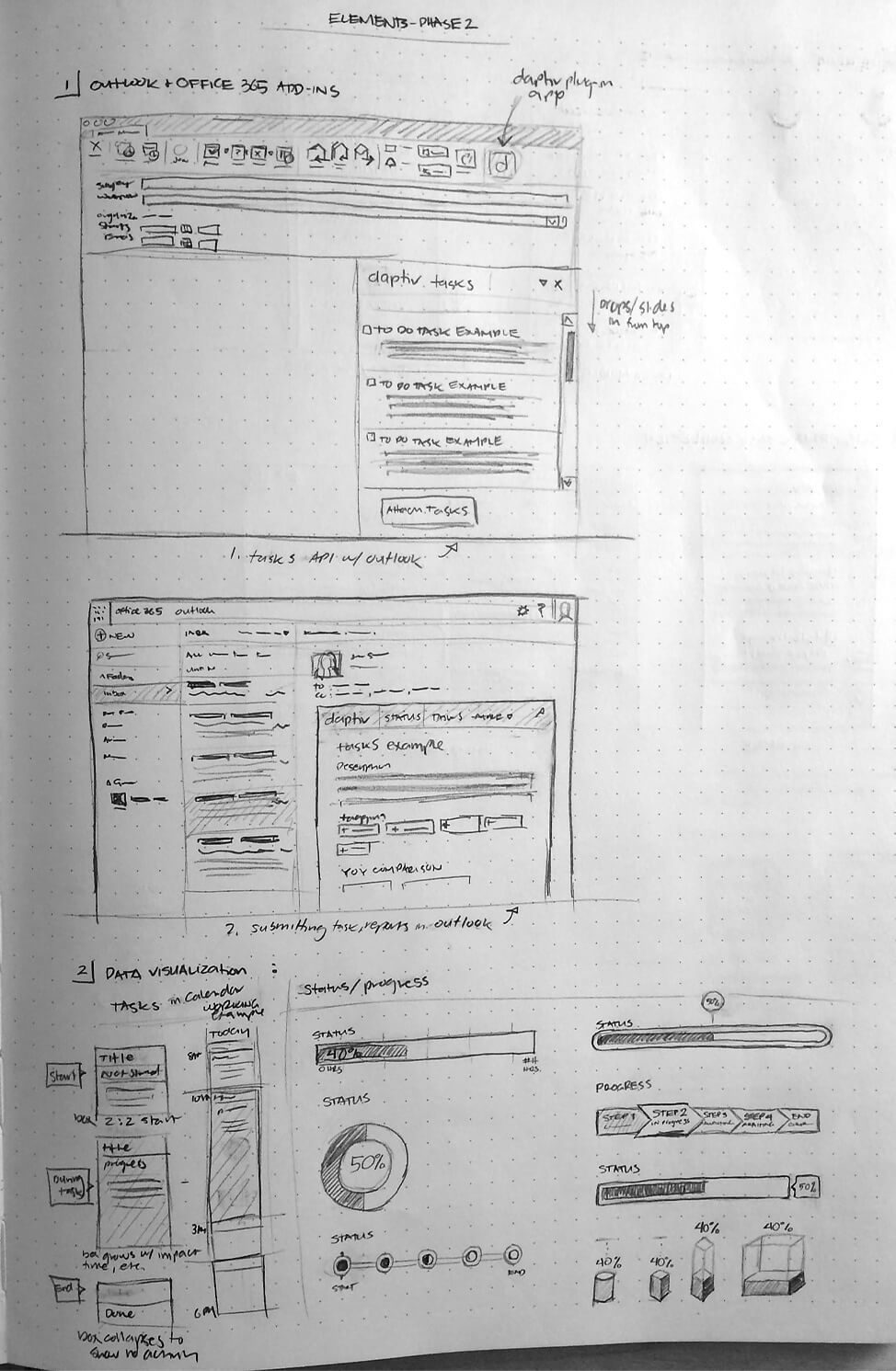
Phase 2 Sketches

Phase 2 consisted of Task API's with outlook, submitting task, and reports within Microsoft Outlook, data visualization, Voice Ready using Natural Language UI, SMS, and Email Task Completion.
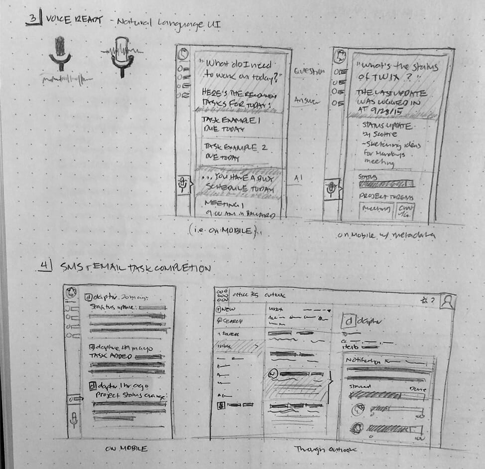
Phase 2 Sketches, Voice Ready and Task Completion

Phase 3 had Collaboration & Communication, Document Management Integration, Smart Tasks, and Data Visualization for Resource Managers.
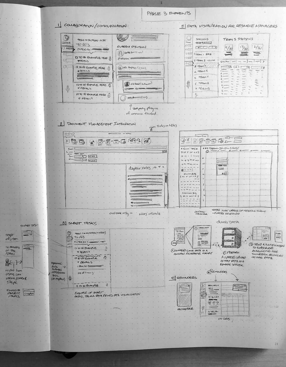
Phase 3 Sketches

We presented these sketches back to the internal team, and they were impressed with the detail and seeing it sketched out. It's been a long time since they had colleagues like us to possibly change the daptiv product to something more relevant in 2015. We were ambitious, and our thoughts were definitely in the clouds, where anything was possible. The entire team was excited.


“I'm impressed that you took our ideas into consideration, sketched it out and presented it back to us. It's been a long time since we've been part of something like this.”

Chris B, Software Architect; Daptiv

I incorporated these ideas and featured them in a future-looking storyboard experience.

Both Jill and Sally realized an opportunity to alter the behavior and input time activity with a mobile-first solution. The business decided it was feasible to go with a responsive site vs. native app due to it's quicker development and go to market strategy.


Storyboard of Futue Expereince for Daptiv Timetracking

In October 2015, we re-focused our phase 1 of our MVP. We concentrated on a Card UI methodology since it accommodates the legacy content we needed to account for tracking tasks and managing time. Below are Jill's notes, discussed features, and thought processes for me to start designing!

Jill's Notes

Jill and I conducted weekly design sprints to extrapolate the business requirements further and refine them into a digestible, potential UI layout. My initial sketches served as the genesis to what TTM and other Daptiv products are today.


My Initial Workwise Sketches

I fleshed out the initial sketches and began the wireframing process in Sketch.

The original product was going to include a Task List and Kanban Board.

Daptiv My Work timesheet wireframes

Nov 2015 Task List Wireframes

Daptiv My Work task list wireframes

Nov/Dec 2015 Kanban Wireframes

During our competitive analysis, we observed Asana, a way to manage team projects and tasks with their new rebrand. Daptiv was also looking to rebrand themselves too and accepted the challenge.

Unfortunately, our minimum viable product (MVP) forced us to push those out to future projects. Our VP of Product appreciated our effort, but scope creep was taking place. The product team understood what was feasible for both engineering and business to pull off in 2016 – consequently, we refocused on refining the time entry experience.


Daptiv My Work kanban board wireframes

Our team dynamic and confidence were different. We had to rally and regain our VP's support and trust. After months of dedication and effort, Sally decided to move on from her post. It was for the best for all involved.

George to the rescue

In came George, a Senior Techincal Product Manager who took over Sally's role. His contributions prioritized the original feature list and steered the project back for success.


TTM 2016 Wireframes

2016 TTM Wireframes

Our team re-prioritize and focused on more precise needs and goals. This Axure wireframe is a reflection of what we're about to build.

2016 TTM Visual Design Concepts

From Left to Right was Concept 1 through 3 and the launched Version. Each concept leveraged the same structure, functionality, and user flow.

2016 TTM Visual Design Concepts for Mobile

Design Set 1 was the bare essentials with time card data. The second set emphasized on drop-down and data entry fields. The third set introduced Project Names (we overlooked it during planning), status colors, progress bars, and additional visual emphasis on data entry fields.

Due to a re-organization, we lost Jill's contribution to this project. George, Eric, and I worked hard to meet our Spring 2016 product launch.


Our Solution

We launched a responsive time tracking management platform for the Daptiv customer base to adopt and use in Spring 2016. Our team continued to iterate as we collected customer feedback. Additional functionality, performance, and aesthetics were significant strides for the TTM product to coexist with the Daptiv ecosystem, which rebranded in Spring 2017.

2017 TTM Visual Design

“Daptiv TTM integrates Daptiv PPM’s portfolio management capabilities which enables project managers to accurately understand resource utilization, better understand where team members are spending their time, and more precisely predict the demand on each resource.”

Eric B., VP of Product Management; Changepoint
My Impression

The application is now Changepoint (CP) TTM to align with Changepoint's suite of solutions. Like most users, they are creatures of habit. As we monitor the adoption rate, George and I continued to add UI clues to increase it. 87% of our users in 2017 enjoyed the experience and the ability to enter time across any one of their devices. It was too early to tell how these results impacted the project manager's insights. Time will tell as Daptiv's businesses continue to evolve.

My Learning

It was exciting to be part of this "greenfield project." There were a lot of moving parts for this project even to see the light of day. Identifying and attempting to solve customer pain points preserved any threat of shutting down this project. I underestimated how much learning and preparation needing for the Product Portfolio Management space. I have respect and appreciation for professionals in this space.

The most memorable part was the brainstorming sessions I had with Jill and the entire Engineering team. To witness their excitement after years of neglect, empowered our Product team to deliver at our highest level. The path to launch took some gnarly turns with loosing and swamping out my colleagues within the product team. However, George's contribution to TTM changed the trajectory of the project. His tenacity, enthusiasm, and passion carried us all across the finish line.